The Redesign
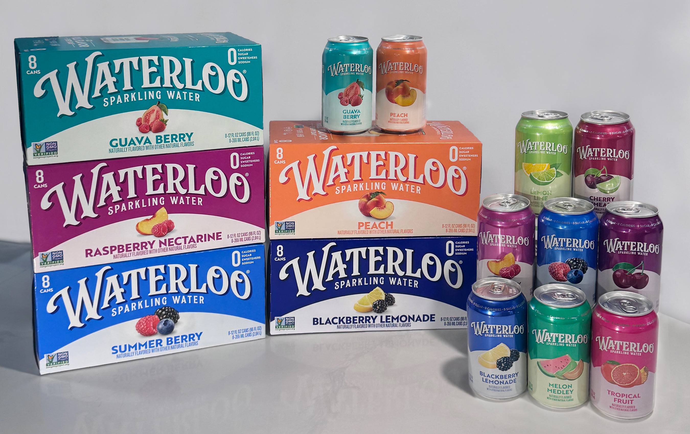
Waterloo Sparkling Water is rolling out its first packaging refresh since the brand launched in 2017, debuting new carton and can graphics across all pack sizes at retail nationwide. Developed with brand agency CBX, the updated design leans into more saturated color fields, sharper flavor cues, and a more prominent wordmark — all engineered to improve shelf findability in a sparkling water set that has grown increasingly crowded.
The timing is deliberate. Kathy Maurella, Chief Marketing Officer at Waterloo Sparkling Water, cited 3X category growth and +17% household penetration growth in the first half of 2026 as the commercial backdrop for the move. "As we continue to bring more households into the brand, we saw an opportunity to evolve our packaging in a way that strengthens brand recognition across all consumer touchpoints while staying true to what fans already love about us," Maurella said.
Shelf Competition Context
The non-alcoholic beverage segment's sparkling water sub-category has seen intensifying SKU proliferation over the past three years, with major CSDs, private-label programs from mass and club channels, and newer functional-water hybrids all competing for the same chilled shelf real estate. For an independently owned brand competing against scaled players, stopping power at the point of purchase carries outsized importance — particularly as off-premise grocery volume continues to represent the core volume driver for NAB brands.
Mark Christou, Principal and Chief Creative Officer at CBX, framed the challenge plainly: "The sparkling water category is more saturated than ever, and most brands are starting to blur together on shelf. Waterloo has always been an intentional choice, built on real flavor and real confidence. This packaging refresh sharpens that story, giving the brand a more vivid, recognizable identity."
Waterloo conducted multiple rounds of eye-tracking studies and tested a range of creative concepts before landing on the final design. The product formulas are unchanged — all flavors remain Non-GMO Project Verified, with no sugar, sweeteners, sodium, or calories — keeping the brand's clean-label positioning intact for health-forward foodservice and retail buyers.
Operator and Retail Implications
For foodservice operators and non-alcoholic beverage buyers sourcing sparkling water for tabletop, catering, or grab-and-go programs, the packaging change has practical implications: updated carton and can graphics will begin appearing in distributor inventory now, and operators managing planogram-adjacent display programs should expect transitional mixed-stock periods as old and new packaging cycle through the supply chain.
The brand simultaneously launched a redesigned website with enhanced shoppability, signaling broader direct-to-consumer investment alongside its retail distribution push. Waterloo's growth metrics — particularly the household penetration acceleration — suggest the brand is building repeat-purchase velocity that could support expanded placement across convenience, club, and natural grocery channels, all of which feed into institutional and foodservice supply pipelines.
The independently owned Austin brand has built its positioning around full-flavor differentiation in a category where many competitors default to subtle or near-neutral taste profiles. Whether the redesigned packaging can sustain its momentum against well-capitalized shelf neighbors will be tested through the back half of 2026.
Written by Michael Politz, Author of Guide to Restaurant Success: The Proven Process for Starting Any Restaurant Business From Scratch to Success (ISBN: 978-1-119-66896-1), Founder of Food & Beverage Magazine, the leading online magazine and resource in the industry. Designer of the Bluetooth logo and recognized in Entrepreneur Magazine's "Top 40 Under 40" for founding American Wholesale Floral, Politz is also the Co-founder of the Proof Awards and the CPG Awards and a partner in numerous consumer brands across the food and beverage sector.