For foodservice operators, energy beverages represent a high-margin category opportunity—but only if the product commands attention and justifies a premium price point. Lotus Plant Power addresses both challenges simultaneously: a clean-label formulation that appeals to today's ingredient-conscious guests, plus distinctive color-coded packaging that creates natural cross-selling opportunities and drives repeat visits.
The Ingredient Story Operators Can Sell
Today's guests read labels more closely than ever. They want to know what they're consuming, and they're willing to pay more for products that reflect their health-conscious values. Lotus Built around Plant Power 7™ (PP7™), a proprietary blend of certified organic plant-based ingredients—green coffee beans, guayusa, green tea extract, coffee fruit, elderberry, Jerusalem artichoke, and ashwagandha KSM-66—the product delivers a talking point your team can actually use.
Rather than relying on caffeine content alone, Lotus positions energy as a lifestyle choice. Consumers were trained by traditional energy brands to choose based on stimulation and performance. Lotus saw an opportunity to approach energy differently. As consumer preferences evolve, people are becoming more intentional about what they put into their bodies. They want products that reflect their lifestyle. That shift has helped create a new era of energy: one that incorporates better ingredients, better taste, and projects a more personal relationship with what fuels us.
For your kitchen, this means a beverage that requires minimal justification. The formulation speaks for itself.
Visual Merchandising That Works Without Extra Labor
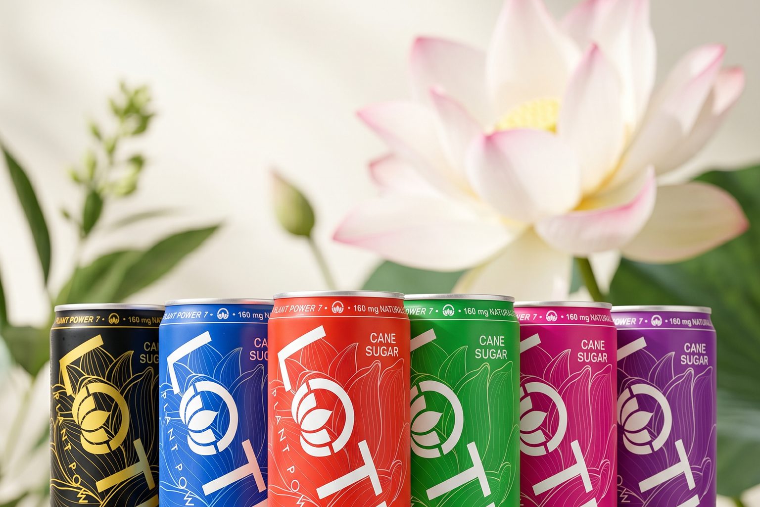
Packaging matters at point-of-sale, but exceptional packaging drives multiple sales. Lotus was designed with a color-driven system—Pink Lotus, Blue Lotus, Green Lotus, Red Lotus, Purple Lotus, Gold Lotus—where color becomes the primary identity rather than flavor alone.
Unlike competitors who redesign packaging with every flavor launch, Lotus built a consistent architecture that allows color to become the hero. The result: a portfolio that feels cohesive on the shelf yet offers guests genuine choice and repeat purchase incentives. One person may choose Pink Lotus for its bright expressiveness. Another returns specifically for Blue. The color system creates psychological differentiation without operational complexity.
This approach has resonated with industry leaders, earning recognition for packaging design and shelf presence within one of the most competitive categories in beverage. For operators, that visibility translates to reduced selling effort and stronger impulse velocity.
Beverage as Accessory—And Traffic Driver
Lotus was built around a simple belief: A beverage is an accessory; it should be intentional, stylish, expressive, and deliver on its promise of efficacy. By combining plant-powered ingredients, premium design, and the iconic Lotus philosophy of Life in Balance, Lotus has created more than a beverage. It has created an identity.
Many consumers refer to this as the Lotus Glow™—the idea that energy is more than a feeling. It is reflected in how people connect, create, move, and express themselves throughout the day. For operators, this perception drives higher attachment rates. Guests don't just purchase an energy drink; they purchase an expression of their lifestyle, which means higher perceived value and stronger margin contribution.
Great packaging does more than communicate information. It creates an identity. Lotus was designed to deliver a premium beverage experience, something a consumer wants to hold, photograph, carry, and identify with. Making each can feel like an accessory. The goal is not just to stand out. The goal is to evoke curiosity.
ROI Through Intentional Design
For decades, the energy drink category has been built around speed, stimulation, and performance. Lotus saw an opportunity to approach energy differently. The future of energy is not simply about more caffeine. It's about a direct relationship with the consumer that projects their image and values.
By combining PP7™ with a color-driven packaging system, Lotus connects what is inside the can with how people express themselves on the outside. Packaging drives trial. Identity builds brands. For your operation, that means less promotional dependency, stronger repeat rates, and a beverage program that differentiates your venue without requiring constant menu restructuring.
By designing energy around color, plant-powered ingredients, personal expression, and a philosophy centered on life in balance, Lotus has created something increasingly rare in the beverage aisle: a beverage accessory that looks and feels as intentional as the people who choose it—and as profitable as operators need it to be.